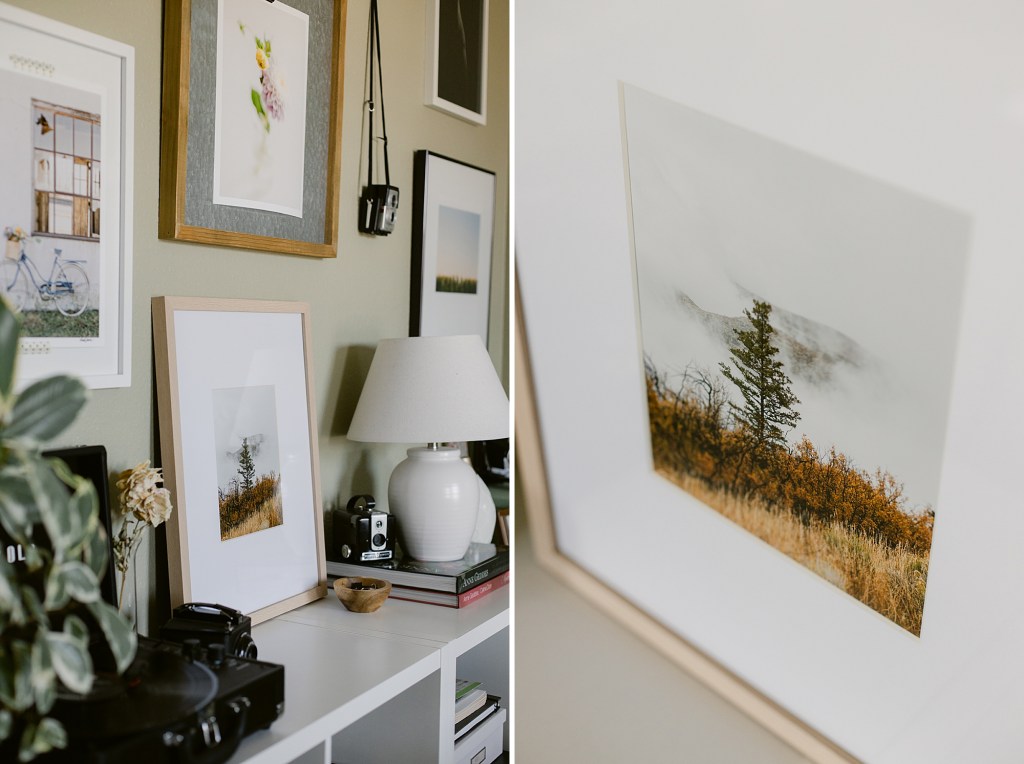
Prints have traditionally always been part of the photography process. Negatives were always meant to be made into prints that could be held and displayed. Digital photography has sort of lead us away from prints. We get instant gratification after we take the shot and once it is shared online there is almost no need to have prints made. I think most digital photographer’s don’t take that next step in getting prints made of their work. And as I think about film photography now, I wonder if the last step in that process is just scanning the negatives.
Images come and go so fast online that they almost have no value to the viewer. We scroll as fast as we can, double tapping the one’s that get our attention long enough to indicate we liked it. They’re temporary. Prints turn that fleeting digital file into tangible, permanent art. Prints not only force a critical look at exposure, color balance, and composition but also induce more connection as to why the photographer took it and how it makes them feel. There is so much to learn from the simple act of taking those image files on a screen and making them into prints.
My journey in photography started in a darkroom. Developing film, making contact sheets to choose the best one and making them into prints. When I moved to Colorado I landed a pretty cool job at a local professional print lab. I started by doing color print orders on the giant Noritsu machine and eventually moved into doing custom black and white prints in the darkroom. I loved that job! Once I got into digital photography and print technology caught up with the labs, I was all in on getting my own printer but on a budget.
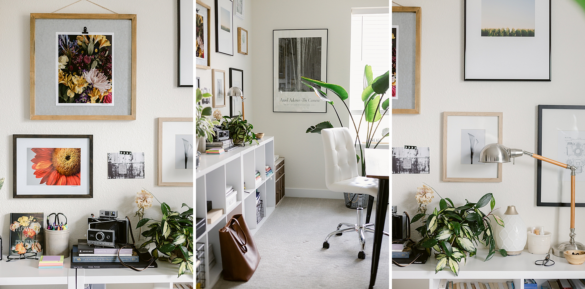
That is where I want to start in sharing what I use and how I go about making my own prints. There are a lot of printers out there and they all have their pros and cons. The biggest factor, at least for me, is budget. You can spend thousands on a printer or you can spend hundreds. The important things for me in a printer are that it can print up to 13×19 inch borderless prints, have at least 8 ink colors including monochrome and that it doesn’t make me go broke. That is how I recently landed on the Canon Pro-200S. The current price I see on BH Photo is not what I paid. If you are patient and willing to wait for a good deal, then start checking on prices during the holiday season. I paid half of what it says today.
Choosing paper can be an overwhelming decision as there are so many different brands, finishes, textures, brightness, weight and so on. I keep it simple. I use the Canon Photo Paper Plus Semi Gloss. This paper has been perfect for my application. I have prints made on this paper from 2015 (from a Canon Pro-100 printer) that are still in amazing condition with no fading. I’ve had prints from the professional lab fade out in that time frame. What I like about using Canon paper is that the paper and printer are pretty much made for each other and I never have color issues. I also use Red River Paper and have been very happy. I love their Polar Matte notecard paper and really like that you can order a sample kit to try some of their different papers.
So my suggestion is to start with the more inexpensive paper and then play around with other brands and paper types. As you start to hone in on what you like as far as weight and finish then you will find yourself gravitating toward a paper you found. Just have fun with this!
I have never had to calibrate my computer monitor. I know this is a step that many photographer’s tout as being absolutely necessary but I have not found that to be so. I have used many versions of the Apple MacBook Pro over the years and have always found that what I see on the screen is what prints out on the Canon printer and paper I have used. I’m sure that is not everyone’s experience but it has been mine for 11 years. This consistency makes printing very easy for me.
Here is my process:
- Edit the RAW photo digital file to my liking in Lightroom
- Export that RAW file to a TIFF
- Continue any edits on the TIFF file in Photoshop and save
- Print a 4×6 print from Photoshop to make sure color and exposure are what I want. Sometimes images that are crisp and bright on a beautiful screen can come out looking dull when printed. When this happens I adjust brightness to compensate and make another 4×6 print.
- If the 4×6 looks the way I want then I save that TIFF with any printing adjustments made and now I can print any size up to 13×19 on my printer.
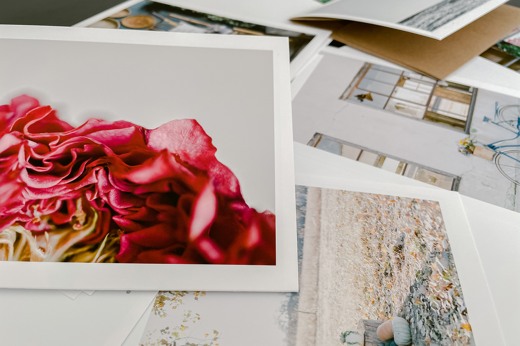
That’s it! I keep the 4×6 prints in a storage box I got from the Container Store years ago. I enjoy going through my large pile of prints and making collections with different themes, help someone see what two different images might look like together, or I’ve even let someone go through these prints to pick out one’s they like. There is something about holding prints in your hand and going through them that I really love.
I hope that helps someone who might be thinking about starting to make prints at home. It doesn’t have to be a difficult task. Even though it’s not the same as the experience of print making in a darkroom it is the next best thing I think. And if you are not quite to the point of doing this at home don’t let that stop you from printing your work. Get your images off of your computer and onto paper you can hold and share.
Thank you for reading today!
B.


Leave a Reply